“When we know that the 80% of human experience is filtered through the eyes, we understand how important the choice of color is.”
This quote comes from the Pantone Institute, who has chosen Rose Quartz and Blue Serenity to be Colours of the Year, 2016.
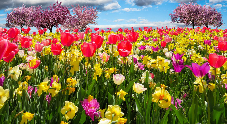
The coming of spring connects our emotions unconsciously to some colours. These associations differ from the colours and emotions of winter. For example, according to Pantone, blending Rose Quartz and Blue Serenity brings calm and serenity. Rose quartz is gentle, calming and reminds us of a peaceful sunset, flowers in bud, rosy cheeks and the cheerful months of springtime. Blue is weightless and airy, like the expanse of the blue sky and the sea.

Colours are linked to emotions, so we must be aware of that when choosing them for our establishment.
To think about the effects that the colours of our tablecloths, napkins, tableware, curtains and decoration in general interact with our client’s mood, is always an interesting and surprising exercise.
What colours prevail in your establishment/events? What emotion do you want to produce on your customers? Do you usually change decoration in your establishment/events according to the season?

For a good combination of colours you only have to observe nature.
What indicates that spring is coming, along with all the positive emotions, is with no doubt the explosion of colour that bring flowers. In order to combine colours wisely, just pay attention to natural elements like flowers, fruits and wild landscapes. Nature never gets it wrong. Gaudí knew that, and devoutedly followed nature’s rules and patterns to create his stunning works.

It makes a difference the way we lay up our tables.
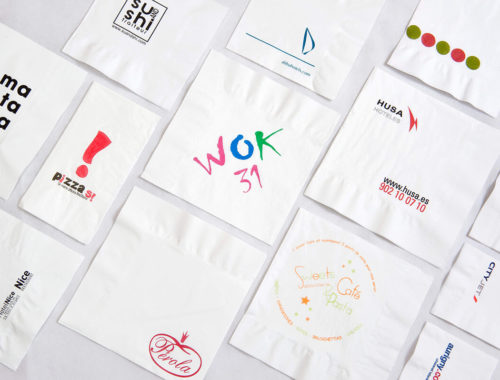
In Garcia de Pou we are aware of the importance of laying up a table with the right colours. Check in our catalogue which combinations can improve the aesthetic quality of the presentation of your tables. For example, the light violet of parma colour napkins set upon light grey tablecloths recall us instantly of a fresh lavender field. The blend of green and orange tones, as well as green and blue tones, demonstrates the exotism of a jungle. Dry Cotton and Like-Linen textures impose an elegant touch. The plaited raffia mats give a rustic touch.

What style do you want to be associated with? In Garcia de Pou we offer you all the possibilities: exotic, natural, elegant, rustic…
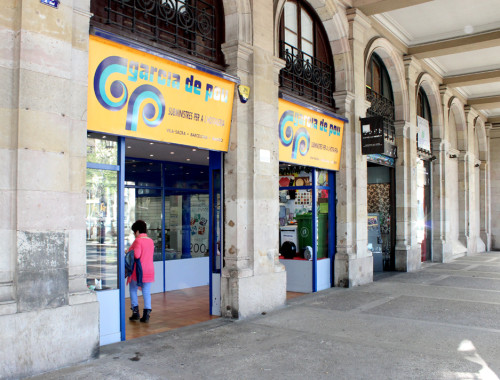
Do not forget that you can purchase small quantities of the products you need in our stores in Barcelona and Madrid, so you are able to test different combinations before making up your mind about the new season’s style.
Enjoy the springtime, its colours and its boundless combinations!