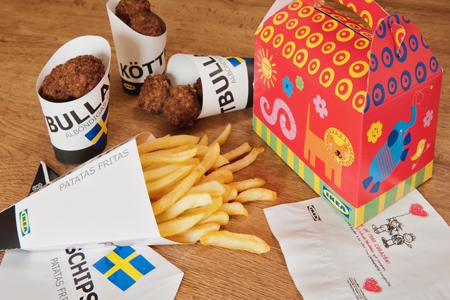
We live in the age of the image, where restoration businesses and the hotel trade find that customisation is a way to create brands with personality and to differ from their competition.
As we were mentioning in our article on branding, there are four aspects to take care of so that the client remains entirely satisfied with his experience:
- The promise of the business must be clear and direct.
- The client’s experience must coincide with the expectation that the business has given them.
- The design, style and service of the place must be coherent with the message.
- Communication must be in harmony with all it’s supports (logo, corporate colours, tone of the message, web, customisation of napkins, glasses, bags, etc.).
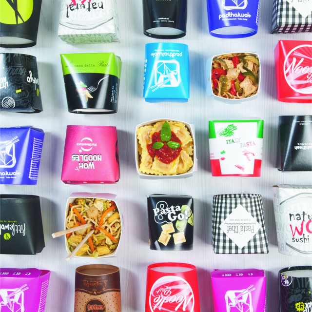
As García de Pou carry printing in the blood, we have the widest experience in printing designs on materials for the hotel trade: napkins, bags, tablecloths, glasses, boxes, containers for take away, etc. In our more than 100 years on the market, we have seen every kind of situation regarding printing.
So to help you to save time and money, we’ll tell you here how to avoid the most common mistakes when creating a design to apply to your customised products.
Always bear the final support in mind
When you entrust your design to a professional, always remind them of where it will be printed. On a napkin with a double layer? On a spunbond tablecloth? On a glass? On a paper bag?
We have digitized mock-ups of all our receptacles (glasses, bag-in-box, boxes, etc). Do not hesitate to ask us for them so that your designer will know the exact measurements and dimensions of the product.
- If the the design will be printed on a soft, spongy surface such as a Double Point napkin, then avoid thin lines as they will not show or take well.
- We advise sending us a vectorized design if it is to be printed on soft or spongy paper or textures.
- Avoid small typographies.
- Some printers have a movement margin from 1 to 3 mm. Bear that in mind for the separation of colors and lines.
- Avoid clear colours on kraft material supports.
- Look for contrasting colours.
- Avoid strong colours on dark backgrounds. They usually produce combinations that don’t look good.
What an ideal customisation process with good development and timing is like:
- Send us your designs on our real mock-ups (if they are confirmed).
- Send us your designs vectorized and in high resolution.
- Tell us the name of the font that you use, this way we’ll be able to find it easily and reproduce it.
- If you don’t use any mock-ups, send us an accurate sketch so that we can easily create the desired result.
- Plan the order in advance so that we can develop it within a reasonable time limit (4 weeks).
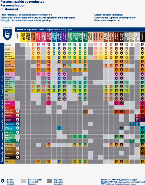
Make sure our referential table of inks and colours of supports is at hand so you can obtain your ideal combinations. Please take a look over this table where inadvisable combinations are shown, as well as which ones are impossible and which ones match perfectly.